The Web: Not Ready for Prime Time?
Jeff Johnson, author of Web Bloopers.
The dot-com crash of 1999–2000 was a wake-up call. It told us the Web has far to go before achieving the level of acceptance predicted for it in 1995. A large part of what is missing is quality. Put bluntly, the Web has not attained commercial quality — the level of quality consumers expect from products and services.
A primary component of the missing quality is usability. The Web is not nearly as easy to use as it needs to be for the average person to rely on it for everyday information, communication, commerce, and entertainment.
A Few Choice Bloopers
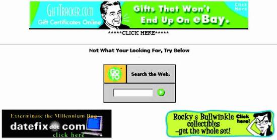
As an example of poor quality and low usability, look at a Search results page from WebAdTech.com, an e-commerce site (Figure 1).
Figure 1. www.WebAdTech.com (Dec. 2000)—No page identification; poorly written error message hard to spot amid ads; unhelpful website search box.
The results are for a search that found nothing. The page has several serious problems:
· Where am I? Neither the site we are in nor the page we are on is identified.
· Where are my Search results? The page is so full of ads, it is hard to spot the actual search results.
· Huh? The message shown for null search results is written in such abysmal English (not to mention inappropriate capitalization), it is hard to understand.
· What now? The remedy offered for not finding anything is a box for searching the entire Web.
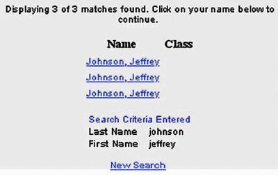
Not surprisingly, WebAdTech was one of the casualties of the dot-com crash; it is gone. However, many sites with significant usability problems remain. For example, searching for my name at the Yale Alumni website yields three Jeff Johnsons, with no other identifying information (Figure 2). The only way to find the right one is by clicking on them.

Figure 2. www.aya.yale.edu (June 2002)—Found items all the same.
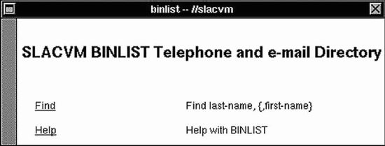
There is also the site map at a Canadian government site that seems to have been designed based on the game of bingo (Figure 3). Not very useful, eh?

Figure 3. www.cio-dpi.gc.ca (Dec. 2000)—Cryptic site map.
Unfortunately, poorly designed websites are all too easy to find. Consider the following examples:
· The auto company site that pops up “Method Not Allowed. An error has occurred.” when visitors do things in the wrong order.
· The state unemployment form that won’t accept former employer names like “AT&T” and “Excite@Home” because of “non-alphanumeric” characters.
· The intranet Web-based application that displays large buttons but ignores clicks that aren’t on the buttons’ small text label.
· The computer equipment company site that contradicts itself about whether its products work with Macintoshes.
· The airline website that can’t remember from one page to the next the time of day you want to fly.
· The bus company site that, failing to recognize a customer’s departure or arrival city, substitutes the one in its list that is nearest—alphabetically!
Unfortunately, the examples are endless. The Web is teeming with bloopers.
Poor Usability Is Stifling the Web’s Growth
Others agree that the Web is sorely lacking in usability. One author provides a blow-by-blow account of the frustrating experience he had trying to buy a wrench over the Web (Casaday 2001). Unfortunately, his experience elicits sympathetic grimaces from anyone who has shopped on the Web.
More systematic surveys have found the same sad truth. A recent survey of 2000 Web shoppers found that approximately half of the people surveyed were “neutral to very disappointed” with the websites they used (Rubin 2002). A Forrester report issued in April 2002 argued that the Web represents a large step backward in usability from desktop software (Souza 2002).
Most tellingly, a survey by Consumer’s Union found that two thirds of Americans distrust and avoid e-commerce websites. This is higher than the percentage of Americans who distrust the federal government or—even in the wake of the Enron and WorldCom scandals—large corporations. A reporter summarizing the Consumer’s Union survey suggested that the problem is mainly that e-commerce websites are not designed in a user-centered fashion:
These sites were often designed by computer programmers. . . . The designers frequently attempted to draw customers with technological bells and whistles while excluding the kind of practical information—return policies, for example—that’s generally easy to find in a bricks-and-mortar retail setting. (Paul 2002)
The bottom line is that for the general population, the Web is low in quality, confusing, aggravating, and insufficiently useful. Poor usability is a big part of the problem. To achieve its potential, the Web’s usability must be improved.
Origins of the Web
To better understand why the Web has not yet attained consumer-level quality, it is useful to review where it came from and how it grew.
The World Wide Web was created in 1990 by Tim Berners-Lee to allow particle physicists to share information with each other over the Internet more easily. Before then, people shared information on the Internet using various programs and protocols: email, FTP, Gopher, and others. The Web standardized and unified data formats and file-transfer protocols, greatly simplifying the sharing of computer files. It defined HTML as the primary format for documents. Naturally, the first websites were created and hosted where Mr. Berners-Lee worked: the Centre European Research Nuclear (CERN) particle-accelerator facility in Geneva, Switzerland.
To access the Web, a Web browser is required. Tim Berners-Lee wrote the first browser and released it to the physics research community when he announced the World Wide Web. This first browser worked only on the NeXT computer. Like today’s browsers, it displayed “rich” text—bold, italics, fonts—formatted in HTML, and it displayed links as clickable underlined text. However, it displayed only text. Images, type-in fields, and other controls, if required by a website, had to be displayed in separate windows, using specialized browser plug-ins and protocols. Because many early Web users did not have NeXT computers, other browsers were soon written. For example, many physicists in the early 1990s used a text-only “line-mode” browser that ran on most Unix computers. This “line-mode” browser was not at all graphical: It displayed only plain text and showed links as bracketed numbers next to the linked text (e.g., “black hole [2]”). To follow a link, you typed its number, as in many character-based library catalog systems.
The first U.S. website was put up in 1991 by Paul Kunz at the Stanford Linear Accelerator in northern California (Figure 4). The main information available on the Web in those early days was physics experiment data, an index of physics papers, and address directories of physicists.

Figure 4. slacvm.slac.stanford.edu (Dec. 1991)—Home page of first U.S. website, viewed through the NeXT Web browser, which displayed only text. This page links to two databases: a directory of Stanford Linear Accelerator employees and an archive of high-energy physics papers. (To visit this page and more of the first U.S. website, go to www.slac.stanford.edu.)
After 3 years of obscurity, the Web took off in 1994, when the National Center for Supercomputing Applications (NCSA) at the University of Illinois released Mosaic. Developed mainly by students, Mosaic was a graphical “point-and-click” Web browser, available for free. Unlike the NeXT browser, Mosaic could display images. Immediately, people in technical professions began creating websites, for both work and pleasure. They were soon followed by a few pioneering online businesses. The Web began growing exponentially: 100 sites; 1000; 10,000; 100,000; 1,000,000; and so on. By the late 1990s, the number of websites was growing so rapidly that most attempts to plot it went essentially straight up.
Rise of the Web: Everybody Who Creates a Site is a Designer
The meteoric rise in popularity of the Web immensely broadened access to information—and misinformation. Most relevant to this article, the rise of the Web has thrust many people into the role of user-interface designers . . . for better or worse. Furthermore, this trend will continue. Although the dot-com crash of 2001 slowed the growth of the Web, it did not stop it. Credible estimates of the total number of websites vary tremendously—from about 15 million to 200 million—because of differences in how a “website” is defined. Nonetheless, Web analysts agree that whatever the number of websites is, it is still growing.
Every one of those websites was designed by someone. As Nielsen has pointed out (Nielsen, 1999a), there aren’t enough trained user-interface designers on Earth to handle the number of websites that go online each year. Thus most sites are designed by people who lack training and experience in interaction and information design and usability. Put more bluntly: everyone and his dog is a Web designer, and almost no one has any user-interface or interaction design training.
In addition to the explosion in the number of Web designers, we had the ascendancy of “Internet time”—extremely aggressive schedules—for Web development. Internet time meant no time for careful analysis of the intended users and their tasks, no time for usability testing before taking the sites live, and no time for sanity checks on the soundness of the site’s value proposition. From the late 1990s through about 2000, thousands of companies—many of them startups—developed websites and Web-based applications “on Internet time.” Business plans were devised on Internet time, large sites were designed on Internet time, and back ends and front ends were implemented on Internet time. Not surprisingly, most of these efforts then crashed and burned . . . on Internet time. Lesson: Maybe “Internet time” is not such a great idea.
Avoiding Past Web Design Bloopers
To paraphrase a well-known saying, those who don’t understand the Web-design bloopers of the past are condemned to repeat them… and repeat them… and repeat them. I wanted to help Web designers get past endlessly repeating bloopers, especially those that are common and avoidable.
Towards that end, I spent several years collecting and categorizing examples of Web design bloopers. The most common ones were recently published in a book: Web Bloopers: 60 Common Web Design Mistakes and How to Avoid Them (Morgan Kaufmann, 2003). The book uses actual website examples to illustrate common design mistakes that frustrate and confuse people and ultimately drive them away. Each blooper described in the book is followed by an explanation of how to avoid it.
In collecting examples of bloopers, I avoided personal websites and websites of very small businesses and organizations. Individuals and small organizations usually don’t have much money to spend on Web development, so it isn’t surprising that their sites contain bloopers. Also, websites of individuals are often more for personal expression than anything else and so must be viewed with great tolerance.
Instead, I focused on larger organizations: companies, government agencies, and non-profit organizations. All have—or at least should have—put significant effort and resources into designing and developing their sites.
My hope is that by learning to recognize and avoid common design bloopers, we will bring the Web closer to the commercial quality necessary for acceptance by mainstream consumers.
For more information about Web Bloopers, please see www.web-bloopers.com.
References
Casaday, G. “Online Shopping, or How I Saved a Trip to the Store and Received My Items in Just 47 Fun-filled Days”, Interactions, Nov/Dec 2001, pages 15-19.
Nielsen, J. “User Interface Directions for the Web”, Communications of the ACM, 42, 1999, pages 65-71.
Paul, N. “Labels Slowly Build Trust in the Web”, C.S. Monitor, 13 May 2002, page 18.
Rubin, J. “What Business Are You In?” The Strategic Role of Usability Professionals in the ‘New Economy’ World”, Usability Interface, Winter 2002, pages 4-12.
Souza, R., “The X Internet Revives UI Design,” Forrester Tech Strategy Report, April 2002, Cambridge, MA: Forrester Research, Inc.
